Website Optimization Tips from a Responsive Web Design Agency
Black Friday is a key time for e-commerce, offering a great opportunity to increase sales and reach new customers. To make the most of this, your website needs to be ready for the surge in traffic and conversion potential. From website optimization to site performance monitoring, every detail counts. In this blog, we'll guide you through actionable steps to refine your site, so you're set up for success with a strong Black Friday strategy. So, let’s get into it.
Website Performance Optimization
As Black Friday approaches, getting your website’s performance right is essential for capturing the increased traffic and turning visitors into customers. A fast, stable website not only improves the user experience but also keeps visitors engaged and drives more sales.
Loading Speed
Your website’s loading speed directly impacts user experience and conversions. If your site takes too long to load, potential customers are likely to leave before they even see your products. On average, mobile users expect pages to load in under three seconds. A delay beyond this can lead to a significant drop in engagement, with a higher bounce rate as users abandon slow-loading sites.
To improve loading speed, start by compressing images to reduce their file size without compromising quality. Next, consider reducing server response times by optimizing your server or switching to a faster hosting provider. Minimizing the use of heavy scripts and reducing the number of HTTP requests can also make a noticeable difference in load times. All of these steps contribute to overall website optimization.
Cumulative Layout Shifts
Cumulative Layout Shifts (CLS) occur when visible elements on a webpage shift unexpectedly during loading, leading to a frustrating user experience. These shifts can cause users to click on the wrong elements, resulting in a poor experience and potential lost sales.
To minimize layout shifts, always set size attributes for images and videos. This helps browsers allocate the correct amount of space before the content fully loads. Additionally, avoid placing ads that load unpredictably, as these can push content around the page. By focusing on stability, you create a smoother, more enjoyable experience for your users, which can lead to higher conversion rates. Monitoring and addressing site performance issues like CLS is an important part of website performance monitoring.
Creating the Illusion of Speed
In cases where actually reducing load times isn't feasible, there are smart design tricks that can help. By creating the illusion of faster speed, you can keep users engaged and minimize frustration.
Progressive Loading
One effective approach is using progressive loading. This involves showing a placeholder version of the final content, such as a pulsing image or blurred text, while the actual content loads in the background. This reassures users that something is happening behind the scenes and reduces the perceived wait time.
Interactive and Engaging Loading Elements
Another option is to replace blank screens with useful content or fun elements. Displaying helpful tips, interesting quotes, or entertaining graphics during loading keeps users engaged and focused, making the wait time feel shorter.
Implementing these strategies as part of your website optimization can improve the overall user experience and reduce bounce rates during high-traffic events like Black Friday.
Accessibility Considerations
Accessibility is an important part of your Black Friday strategy, especially during high-traffic periods. Making your website accessible helps you reach a broader audience while meeting legal and ethical standards. A site that accommodates users of all abilities can lead to better conversion rates during events like Black Friday.
Accessibility Features
Touch Screen Gestures
Supporting intuitive gestures like swipe and zoom is a necessity when creating a user-friendly experience on mobile devices. These gestures should be simple and easy to use, allowing all users, including those with disabilities, to navigate your site smoothly. Simplifying gestures contributes to your overall website optimization by making the site more accessible and user-friendly.
Target Size & Spacing
When designing for touch screens, consider the "one eye, one thumb" rule. This guideline suggests that users should be able to interact with your site using just one hand, with all buttons and links large enough to tap easily. Proper spacing between interactive elements helps avoid accidental clicks, especially on smaller screens. Focusing on this in your site optimization efforts will make your site more accessible and improve the overall user experience.
Visual Elements
Clear hit areas for links and buttons are important for accessibility. Avoid using full-width, vertically scrollable elements, as they can be challenging for users with motor impairments. Instead, focus on designing clear, easily identifiable areas for interaction. This approach improves accessibility while also making your site more usable, aligning with website performance monitoring to create a smoother, more inclusive experience for all users.
Mobile Optimization
With the surge of mobile users during Black Friday, a successful mobile strategy means a successful Black Friday strategy. Mobile-first design prioritizes mobile device performance, ensuring users have an optimal experience.
Arctic Leaf’s projects, such as General Admission and Instasmile, exemplify the importance of designing with mobile users in mind. By prioritizing mobile-first, you can capture a larger audience and create a smoother shopping experience.
Key Mobile Optimization Strategies
Responsive Design
A responsive website design agency like Arctic Leaf focuses on creating a site that adapts smoothly across all devices. By using a mobile-first design, your site will be optimized for mobile users without compromising the desktop experience. This approach to website optimization ensures that your site performs well, regardless of the device being used.
Touch-Friendly Navigation
Mobile users need clear, tappable elements to navigate easily. An example of this can be seen in Old Whaling’s 2-column template, designed to make browsing through a large catalog simple on mobile. Prioritizing user-friendly navigation like this contributes to site optimization and a more engaging mobile experience.
Minimizing Load Times
Fast load times on mobile are essential for keeping users engaged and preventing high bounce rates. Asset optimization—compressing images, reducing unnecessary scripts—plays a major role in improving site speed. Monitoring site performance helps you maintain the necessary speed to keep customers on your site during high-traffic periods like Black Friday.
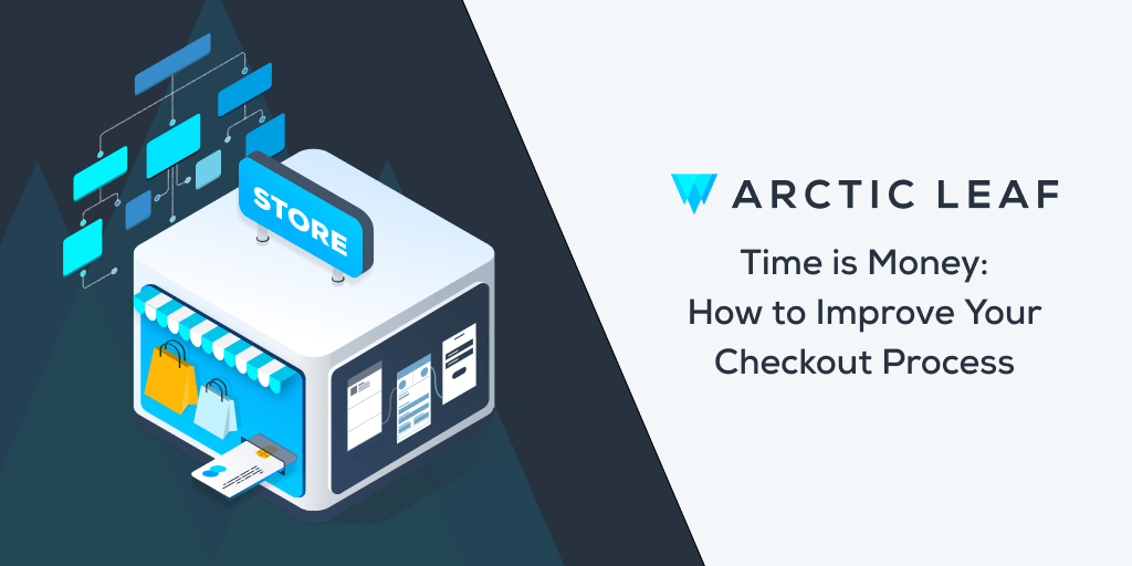
Assessing and Optimizing Your Checkout Process
A smooth mobile checkout is essential for converting customers, especially during high-traffic events like Black Friday. If the process is clunky or time-consuming, users are more likely to abandon their carts. Simplifying checkout steps, offering guest checkout options, and integrating payment methods like Apple Pay or Google Pay are quick ways to improve the experience.
Tips for Optimizing Mobile Checkout
To optimize the mobile checkout process, follow these steps:
- Prioritize Clear, Tappable Buttons: Make sure buttons are easy to tap on mobile devices.
- Minimize Form Fields: Reduce the number of fields to speed up the checkout process.
- Reduce Distractions: Focus on completing the purchase by minimizing unnecessary elements.
- Improve Load Times: Aim for fast load times to prevent frustrating delays.
- Test Checkout Flow: Regularly test the checkout process to identify and fix any issues.
Case Study: Instasmile UX Audit
A recent UX audit for Instasmile led to a more efficient mobile checkout experience by focusing on website optimization. Reducing the number of steps and simplifying the payment process contributed to higher conversion rates, especially during peak periods like Black Friday.
An Expert Touch
Three recent mobile-first projects, General Admission, Old Whaling, and Instasmile, demonstrate the power of a well-designed mobile experience. For General Admission, the goal was to create a responsive website that allowed for website optimization across devices. The result of this project was a website which far exceeds industry standards.
|
Metric |
Industry Standard |
General Admission™ |
|
Mobile Page Load Speed |
8.6 sec |
PDP: 2.7 sec / Homepage: 3.3 sec |
|
Desktop Page Load Speed |
2.5 sec |
PDP: 1 sec / Homepage: 1.2 sec |
Similarly, the Old Whaling project focused on improving both performance and user experience. By adopting a two-column template for mobile devices, we were able to streamline navigation and boost engagement by 13%.
When looking for a starting point for your own mobile theme, the Arctic Leaf team is excited to introduce you to the Bamboo theme, a mobile-first, performance-focused option designed to improve user experience with features optimized for speed and responsiveness.
To fine-tune mobile performance, UX audits play a key role. During the Instasmile UX audit, we identified usability issues within their cart & checkout, product page functionality, form field accessibility and more. To fine-tune mobile performance, we conducted a UX audit for Instasmile, improving their cart and checkout process. The Smile Assessment launched August 6, 2024 and the amount of people who have added to cart and started checkout has more than doubled. In fact, 35 days following the launch, there has been a 51.2% increase in people taking these initial steps. Regular audits like these can reveal hidden opportunities, helping your site perform better during events like Black Friday. Incorporating a strong black friday strategy and site optimization can have a significant impact on your mobile conversion rates and overall user satisfaction.
Conclusion
Preparing your website for Black Friday involves refining every detail to turn visitors into loyal customers. Each element is important in a successful Black Friday strategy, from website optimization to site performance monitoring. By focusing on mobile-first design, accessibility, and fast load times, you’ll stay ahead of the competition. If you need help getting a jumpstart, reach out to Arctic Leaf for guidance. And remember to monitor your site’s performance with tools like the best website speed test. With the right strategy, this Black Friday could be your most successful yet!